With the Arizona Diamondbacks’ 25th anniversary right around the corner, it’s hard not to acknowledge the impact this franchise has made in their short history. They achieved success and reached the pinnacle of baseball faster than any expansion team before them in sports. They also looked damn good doing it. Whether it was the OG Purple & Teal or the Sedona Red days, the D-backs haven’t shied away from unique uniform combinations that represent both the state and the team. Specialty jerseys aside — such as Players Weekend and holidays — we take a look at the best and the worst designs in club history.
T22.) White and Red Snake Gradient Uniforms (2016) Red and Black Snake Gradient Uniforms (2016) Black and Red Snake Gradient Uniforms (2016)
While this combo that debuted on the runway at Chase Field in 2016 do deserve more credit than they get for originality, they also earn the dubious honor of worst uniforms in team history. They just flat out didn’t work. The cap, the jerseys, and the pants all had a snake-like gradient pattern that didn’t appeal to fans. It didn’t help that the gradient also looked strange on TV. Credit where credit is due for incorporating the Sedona Red, the classic teal, and the attempt at a snake-skin pattern, but it was hard to get past how offensive these were to your eyeballs. With that being said, some of their gradient pattern uniforms managed to sneak into a higher ranking on this list. Just not these.
Courtesy of https://www.foxsports.com/arizona
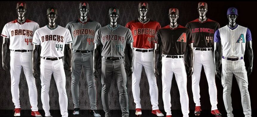
T20.) White and Sedona Red D-backs Current Uniforms (2020) Sedona Red and Black D-backs Current Uniforms (2020)
There is absolutely nothing wrong with these current uniforms…other than they are boring. Not only is it a basic combo we’ve seen in the past before, but these really are the most basic versions of their simple Sedona Red design. We’ve been conditioned over the years by the D-backs having some distinct uniform combos. They even went too far with the gradient design. While simplicity can be sexy, it would be refreshing to see something new and a bit more complex. And if they’re going to bring back a uniform from any era, we all know there’s only one choice.
Credit: Joe Camporeale-USA TODAY Sports
19.) Original White Diamondbacks Pinstripe Uniforms (1998)
The jersey that started them all. This purple pinstripe design was the first jersey worn by manager Buck Showalter when he took the helm of the D-backs long before they played their first game. The original hat was also white with a purple brim and the look was quickly known as the “Ice Cream Man” by the players. It was too much white on white and was quickly usurped by other combos as the team’s regular home jersey.
Courtesy of NBCSports.com
18.) Sedona Red and Sand Uniforms (2007)
These uniforms were part of the first class of the Sedona Red era when the franchise moved away from purple and teal as their primary colors. At the time, it coincided with a move the Arizona Coyotes made towards the same colors, which were all falling in line with matching the Arizona Cardinals. While there was some excitement about this All AZ matching color scheme similar to the way teams in Pittsburgh were coordinated, the excitement was short lived. Still, the move to colors like Sedona Red and Sand felt like a solid representation of our state.
Courtesy of MLB.com
17.) Grey and Red Snake Gradient Uniforms (2016)
The D-backs away grey uniforms have always been on point. It may be as simple as the shade of grey they use, but the grey and red snake gradient uniform was no different. It stood out from the pack of gradients perhaps due to the way the pattern blended better with the grey. While the others were perhaps too much of a contrast, this one worked well.
(Tim Heitman / USA Today Sports)
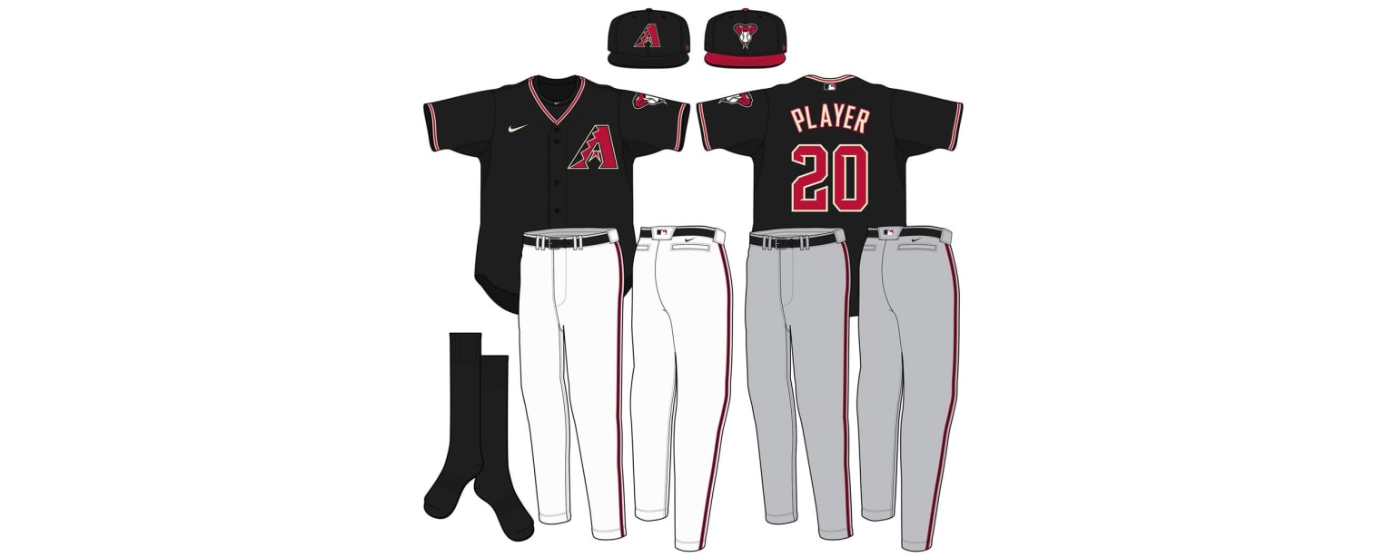
T15.) Black and Sedona Red Uniforms (2007) Black and Sedona Red Current Uniforms (2020)
These two jerseys are the equivalent of the ‘Spider-men pointing at each other’ meme. Black has always been a staple of the D-backs jersey colors. These fit right in and are good looking kits. Again, like others on this list, they’re just a bit plain when compared to other designs. There isn’t much to remember here. The design has been altered over the years with different patches or small changes, but it’s still the same design introduced in 2007. The current one really should incorporate more of the teal we’ve seen used in other jerseys.
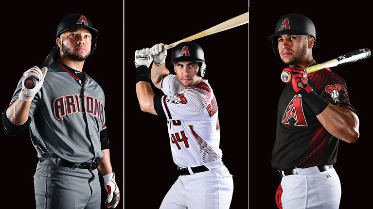
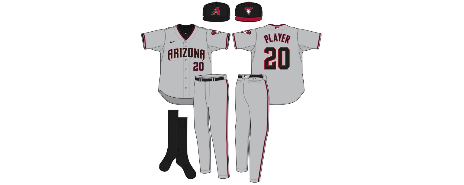
T13.) Grey and Sedona Red Current Away Uniforms (2020) Grey and Sedona Red Away Uniforms (2008)
This is another case of past and present being so similar that it’s hard to rank these two combos differently. While the current jersey has a bit more flair with the Arizona font, these are both just too close to call. As stated before, the D-backs grey away jerseys have always looked great, but they do fall victim to being less memorable than other kits in team history.
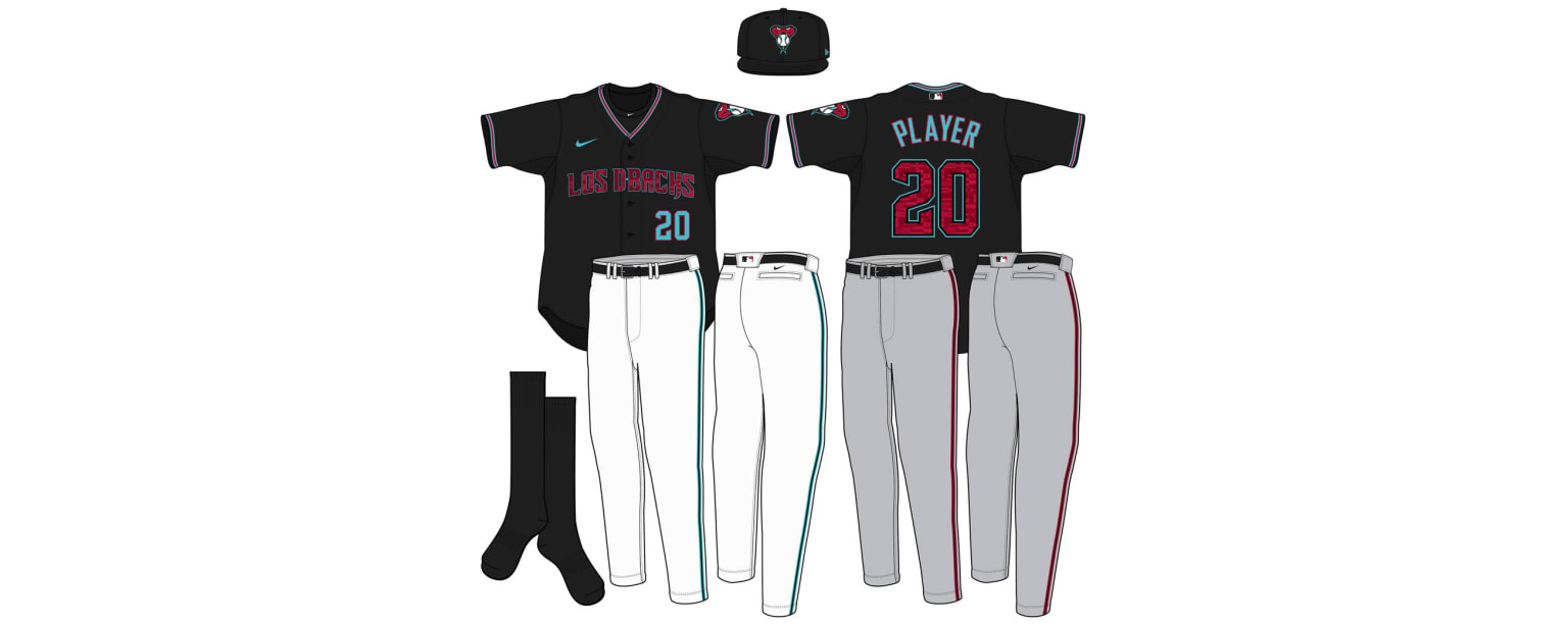
12.) Black, Red, and Teal Los D-backs Current Uniforms (2020)
This uniform combo really pops. The combination of black, red, and teal look better together than imagined with the Los D-backs moniker representing our Hispanic culture both on the team and in the Valley. When Arizona decided to merge past and present colors, this was surprisingly the perfect mix and should have been the blueprint for their designs instead of going with a more basic approach.
Courtesy of Dbacks.com
11.) Purple Arizona Uniforms (1998)
These purple uniforms with Arizona in teal and the teal, black, and copper sleeve accents were a thing of beauty. Perhaps maybe a little too much purple when paired with the matching purple hat while existing in Barney the Dinosaur’s prime. Jokes were definitely made. These were also unique for home uniforms due to having Arizona across the chest and were only worn as away jerseys a handful of games.
Courtesy of NBCSports.com
10.) Arizona A White Pinstripe Uniforms (1998)
The White “A” pinstripe uniform combo was really good and an upgrade from the earlier white pinstripe jersey with Diamondbacks across the front. There has always been something alluring and intriguing about a logo one may not be familiar with. The A logo with its three colors and snake accents is arguably the best in history. This one only suffers for its resemblance to the vest and shirt jersey. Once we knew we could cut the sleeves off of this one, it became expendable.
Diamondbacks Randy Johnson (51) greets pitcher Brandon Webb (R) and Curt Schilling (L) as the group was chosen for the Diamondbacks 20th Anniversary team prior to a Diamondbacks game at Chase Field in Phoenix, Ariz. on Aug. 4, 2018.
Diamondbacks
T8.) White and Teal Snake Gradient Uniforms (2016) Grey and Teal Snake Gradient Uniforms (2016)
These ranked surprisingly high, but it is hard to deny how much better the teal-based gradient jerseys with Sedona Red accents were than their fellow snake gradients. The jersey’s gradient pattern wasn’t as prevalent. Instead of being used on the shoulders and down the side, it was just used on the back under the player’s name and blended down. These two were by far the best of their class, with the white and teal having a slight edge for its clean look.
Stephen Lam/Getty Images
7.) Arizona A Grey Pinstripe Uniforms (1998)
Pinstripes were an indelible part of the D-backs’ brand early on and should have never been abandoned. The grey jersey with purple lettering for the player’s name and the Arizona across the chest mixed with the teal player numbers was a fantastic contrast considering how drab most away jerseys were. These were colorful and distinct while still fitting in with MLB’s general requirements for away jerseys. An all-time classic.
Jonathan Daniel/Getty Images
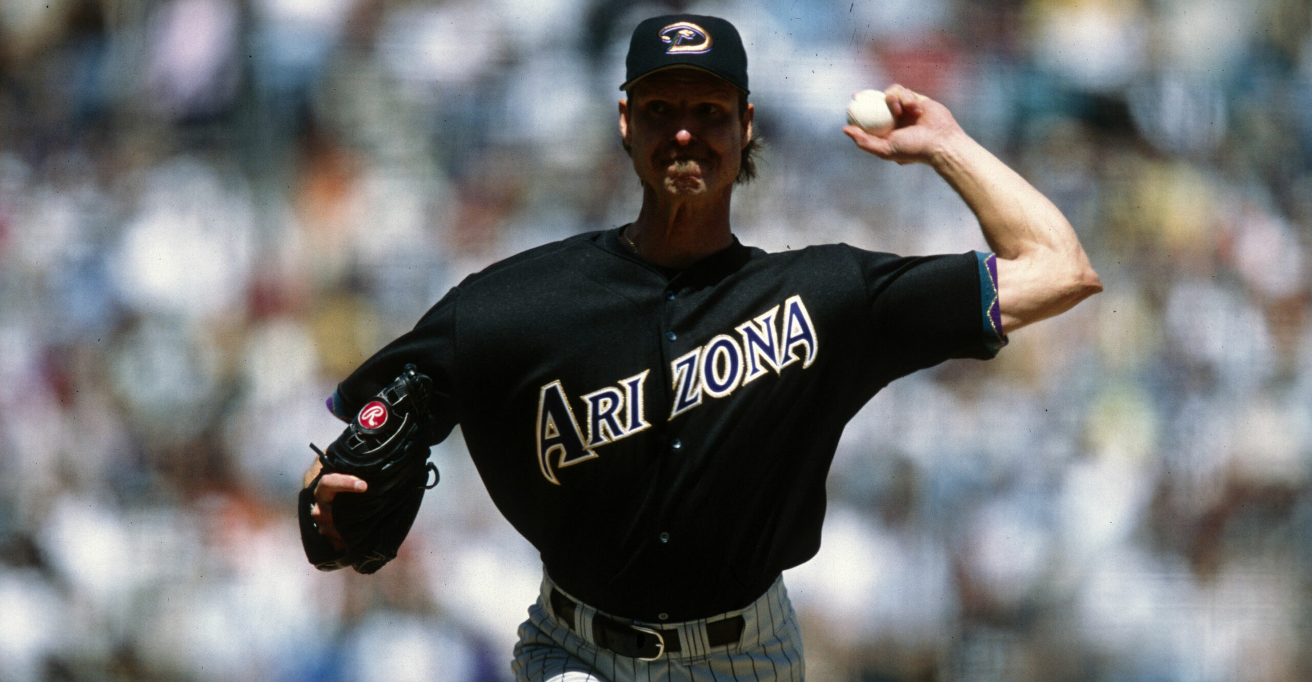
6.) Arizona A Black Uniforms (2001)
The black jerseys from the purple & teal era were just cool. Again, the color combinations on the dark jersey really popped. The Arizona A logo on the front with purple player name and teal number was just a solid visual combination. Much like other jerseys, they found a way to improve it when they changed to Arizona across the chest, but this jersey still stands up as one of the best in D-backs history.
Courtesy of AZSports.com
5.) Arizona A Grey Pinstripe Vest Away Uniforms (2001)
The D-backs vest uniforms were so unique. While we have seen other teams like the Cincinnati Reds incorporate vest jerseys into their rotation , it’s not used often. Mixed with the pinstripes, it really became an iconic combo for Arizona. Players also loved wearing them, citing how comfortable they were. It was a win-win. It’s also tragic that we never once got to see this team wear just the vests on a hot July day in Arizona.
Credit: Robert Hanashiro, USA TODAY.
4.) Serpientes City Connect Uniforms (2020)
The simplicity of the D-backs Serpientes cream colored City Connect uniforms is what really wins you over. One of the most divisive jerseys in team history, people tend to either love it or hate it with little middle ground. It harkens back to the age of baseball when jerseys stood the test of time. The cursive snake forming the Seprientes name is by far of the best snake designs the team has ever had next to their bite the baseball logo. It was fresh and new while also looking like it just stepped off a railcar in the 30’s. Criticism about the simplicity and the cream and black color scheme were well warranted, but it just looks too good to not make the top 5.
Credit: Allan Henry-USA TODAY Sports
3.) Home Teal Current Uniforms (2020)
It’s not all about the glory days. The D-backs current home teal uniforms are fantastic. While the team has had many hits and misses when it came to combing their two eras of colors — mostly misses — this is the one that transcends. The black with Sedona red trim on the D-backs name across the chest and one of the player’s numbers mixed with the teal for the player’s name on the back and other player’s number seems to tie everything together with the simplicity they were seeking for their current uniform set.
Credit: Mark J. Rebilas-USA TODAY Sports
2.) Black Arizona Uniforms (1999)
You can’t think of this jersey without thinking Randy Johnson on the mound mowing down batters. The big difference between this black jersey and the Arizona A black jersey is that once the vest and shirt combos were introduced, the D-backs regular jerseys looked a bit weird with just the A in the left side. That became a staple of the vests. Once the D-backs changed this one to include Arizona across the chest, it just looked right. Like a work of art. The diamondback accents on the sleeve and the distinctive colors this team became known for on the black background was by far one of the best jerseys ever.
Brad Mangin/National Baseball Hall of Fame and Museum)
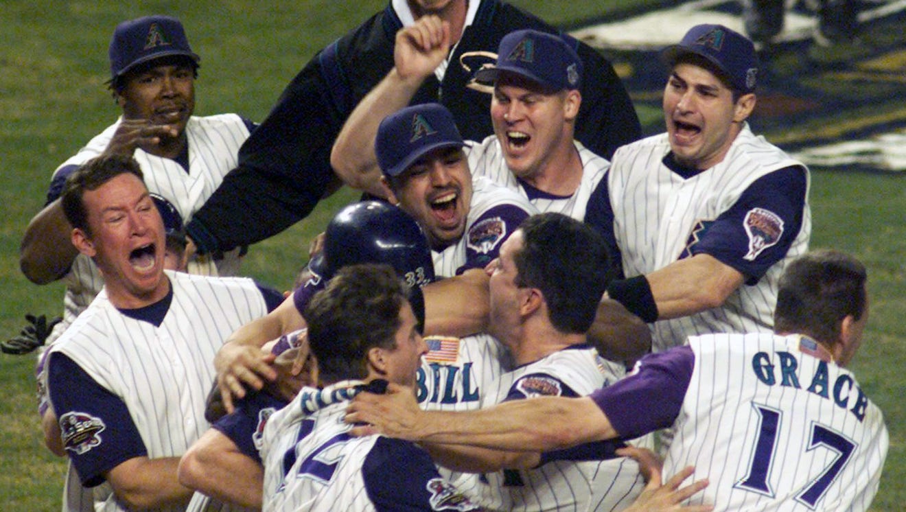
1.) Arizona A White and Purple Pinstripe Vest Home Uniforms (1999)
Recently ranked 19th on ESPN’s list of the best all-time MLB jerseys, these are hands-down the most memorable jerseys in franchise history. As well as an absolute total look. The purple shirt with the pinstripe vest combo. The teal and purple Arizona A with copper trim. It had the classic simplicity of uniforms from the past while also incorporating so many attributes of this great state. They also won their most important game ever while wearing it. In short, it was perfection. The recognition it receives is the reason why it stays in their rotation and has a good chance of making a full-time comeback during their 25th anniversary season. All hail the GOAT.
Courtesy of AZCentral
Thoughts? Did we miss any? Leave us your comments over at @PHNX_Dbacks on Twitter!
Get Arizona's Best Sports Content In Your Inbox!
Become a smarter Arizona sports fan with the latest game recaps, analysis and exclusive content from PHNX's writers and podcasters!