© 2026 ALLCITY Network Inc.
All rights reserved.


One of the highlights of the Phoenix Rising calendar, kit reveal day, is upon us. While we eagerly await the latest addition, let’s take a look back at the best and worst of years past.
No prizes for those of you who knew that there’d be a white kit sitting in last place. Everybody knows that Rising’s performance suffers a drop-off when playing in white, and frankly it’s hard to reward the lack of individuality: everyone has a white kit.
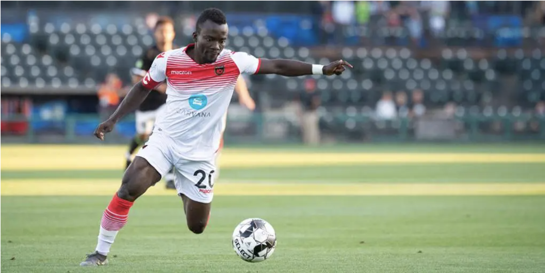
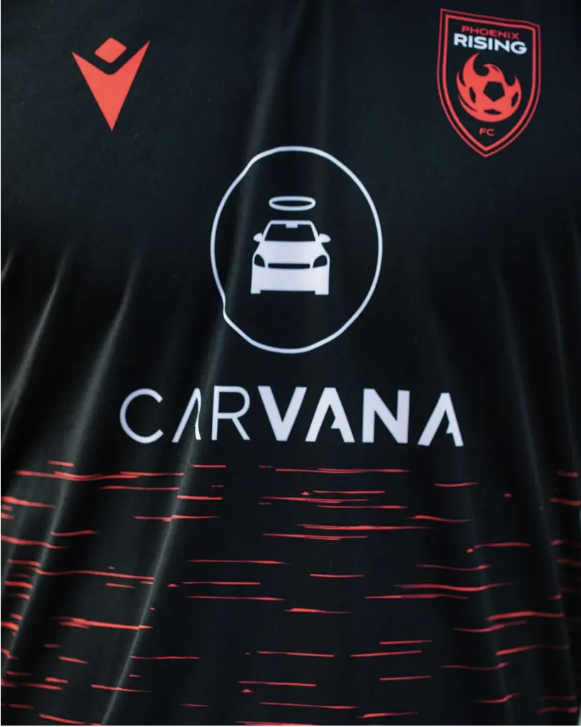
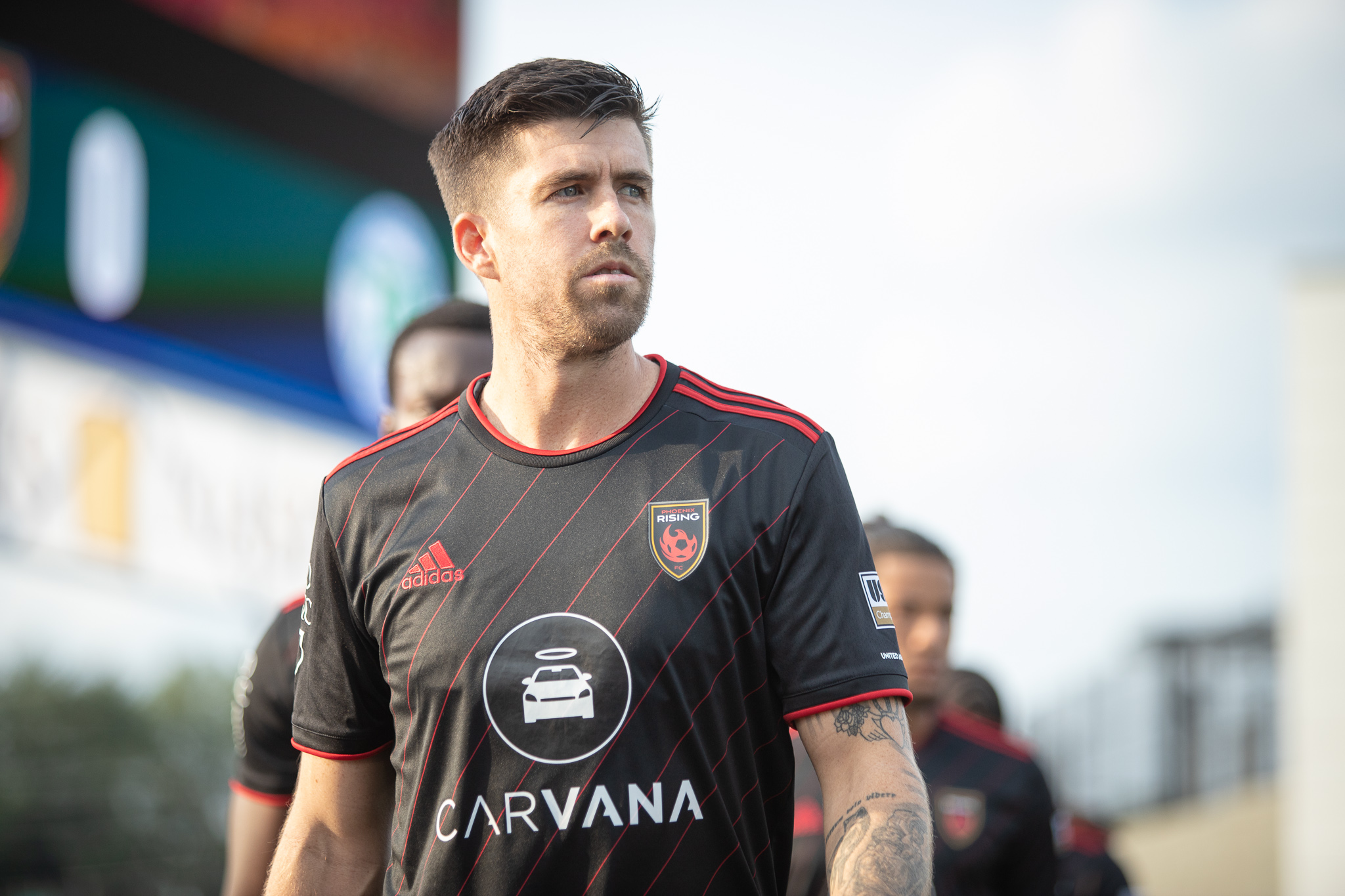
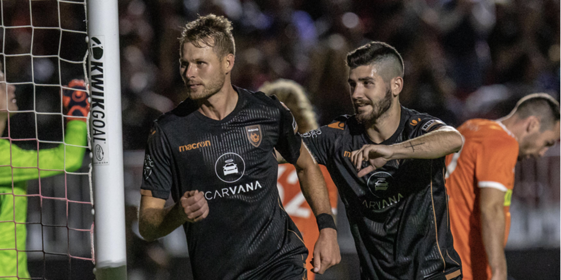
This one really pushed the limits, though. The shirt itself might not have been the worst, but the bright blue Carvana logo? Yikes. Honestly, it just makes the kit look cheap, which is a shame given some of the other Macron designs.

Oh, and the fact that Rising was subjected to this kit for more than a year? That only makes it worse.
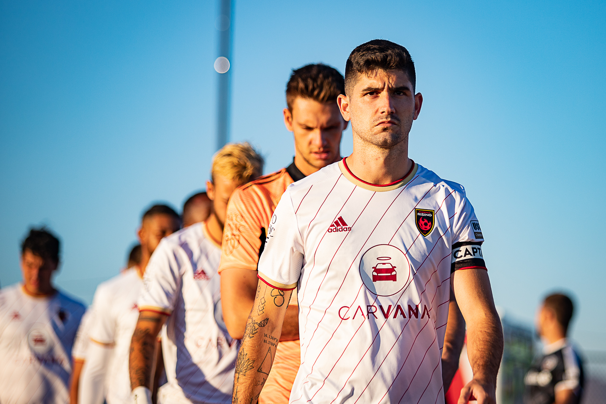
I’ll give Rising some kudos on this kit. Unlike the last, it doesn’t look cheap. Nor is it just a plain design. In a league where everyone has a boring white kit to display, the club actually made an effort here to produce something a little more unique.
That’s the thing, though. Unique as it might be, there is something just… wrong about it. Those diagonal red stripes on a white background, plus the addition of gold for some reason, gives me a strange feeling in my stomach that I can’t quite explain.
Then again, maybe that’s just the memory of losing to Oakland in Livermore.

Congratulations, Rising. This one doesn’t feature an ill-colored sponsor logo, nor does it invoke the confusion of the previous kit.
It is, however, effectively a white T-shirt. What else is there to say?
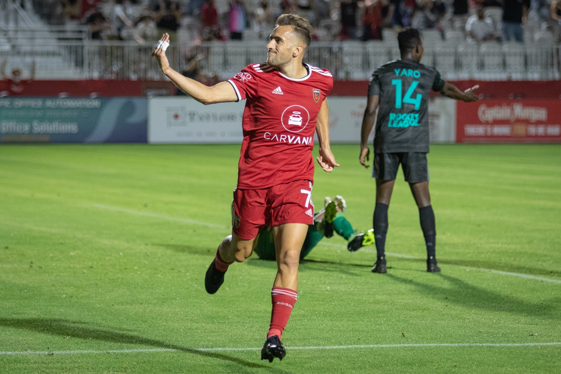


Look, I understand the need for a home kit to be simple. I really do. Home kits are about tradition and sometimes that’s something that needs minimal tweaking.
There’s simple, and then there’s just, well, unremarkable. The use of red on red is a little too bland, especially when other options are available.
It’s not that these kits are bad. Far from it, but they’re too plain to justify being ranked much higher.
I can already sense the reaction to this kit being ranked where it is.
On the one hand, there’s jeering for how high it is: it’s a white kit! How can it be ranked higher than an actual red kit?! Quick, take a look how the results were compared to every other color.
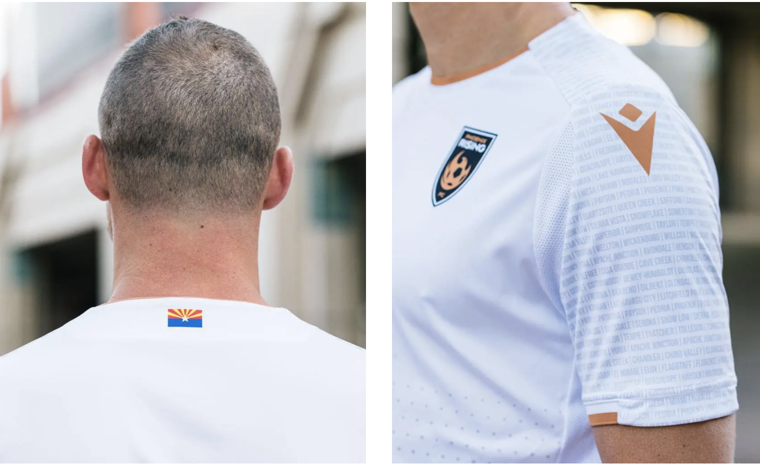
Then, there are the devotees to this strip. It’s the copper state kit! How can you hate on something that’s so uniquely Arizona-focused?
Well, the answer is somewhere in between. This is the one white kit where Rising actually hit the target. Its design gives it character that sets it apart from the rest of the league.
However, it is still a white kit (yes, I will hold that against it) and the timeframe isn’t conducive to good memories. This kit appeared in a sole season, right as the pandemic first hit, stadiums remained mostly empty and Rising suffered a chapter of its history that we’d rather not relive. Maybe it’s unfair to hold those aspects against it. It’s an inanimate piece of cloth, after all, but I can’t help but feel the overall memory of it is tainted as a result.

For all the white kit hate, surely this is something we can agree on? Black kits just look good. It’s really, really hard to get a black kit wrong (looking at you, San Antonio).
Fundamentally, these are the same kit. Yes, there’s the little dedication to the fans on the 2020 version, but they’re mostly the same. Nice shirts, and ones you could easily wear outside of a stadium.
I’m sure you’re asking the question: What is different about this Rising kit compared to the previous?
Well, you’re kind of right. It almost feels as though the biggest change between 2020 and 2021 was the move to Adidas. I’d disagree slightly here, though. The inclusion of the subtle red stripes as opposed to the ‘glow stick’ design of the prior year makes the kit less unique, but it does get rid of some of the questions around what exactly that means while retaining some character in the kit.
I mean, who wants to have to explain what their strangely patterned kit means, anyway?
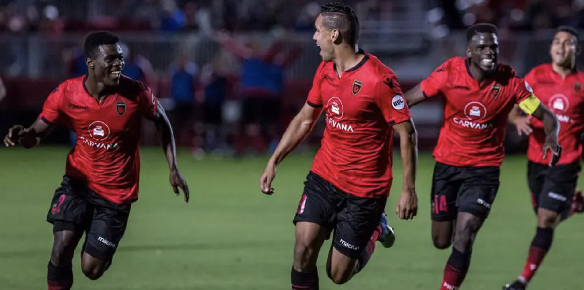
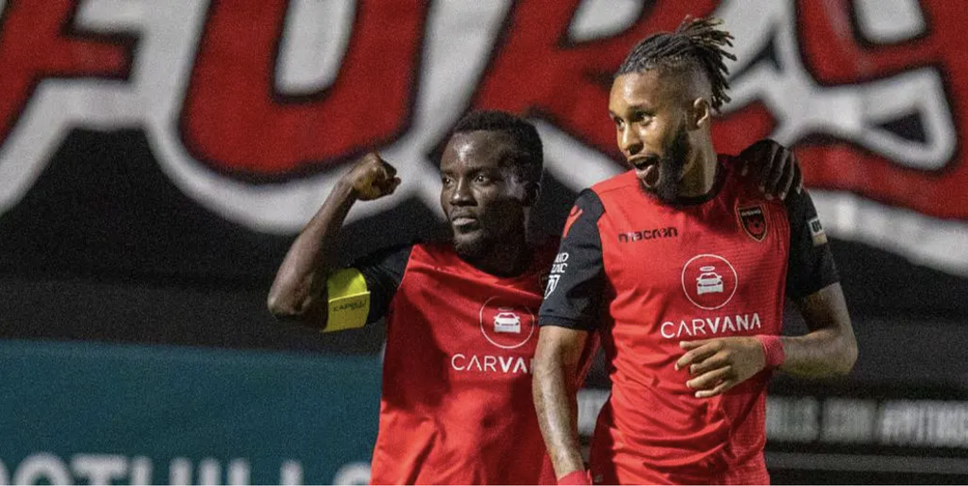
Oh, for the days of red shirts and black shorts. There’s something just a bit more fun about them, isn’t there?
No? Well, you’re wrong, but at least you have to concede that the football was fun. Ultimately, no kit can be truly divorced from its season, and these two were fun years for Phoenix.
The 2018 season saw the club make its first playoff final. In 2019, the club won the regular season title, while also smashing the domestic consecutive wins record with 20 in a row.
These two kits were present when Phoenix first tasted success without the same weight of expectation felt now. Wasn’t everything just simpler back then (unless you were Rick Schantz in early 2019, of course)? Red shirt, black shorts, win secured. Easy.
By now, the choice for Rising’s top kit shouldn’t be a surprise.
This isn’t the only copper kit on the list: 2020’s away kit came in mid-table. It is, however, the original and some (like me) would say it’s the best.
I’ve already laid out my view on the quality of black shirts, so I won’t bore you with that, but the copper here just worked. Like, it really worked.
Plus, how can you look at this kit and not get flashbacks to dollar-beer night wins? It’s impossible.

